TeamFordRaptor
Active Member
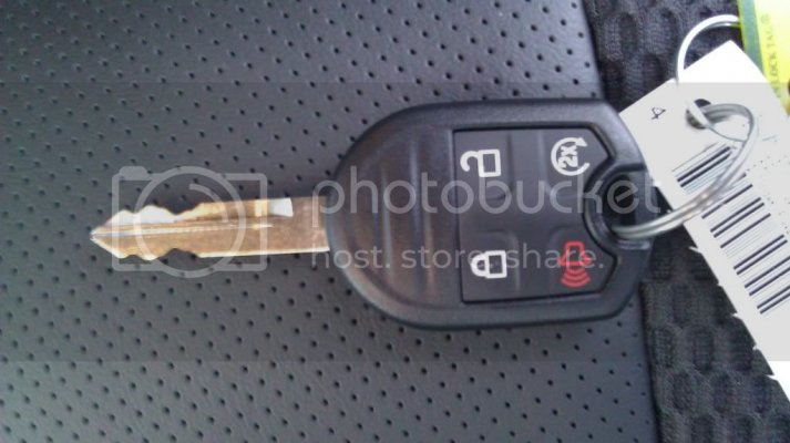
First let's start with the key. Finally the key has followed suit of the Super Duty, Mustang and Edge. It takes the key, and the fob into one single key. Auto start is easy by pressing the Lock button once followed by the Turn-Over button twice. Auto start can be diasbabed or enabled in the menu with a run time of 5, 10, or 15 minutes.
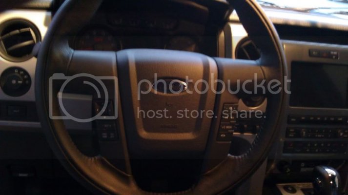
Next the Steering wheel. Same basic wheel as before with the same feel, texture and response as the 2010. The menu buttons are however better than the Super Duty in comparison with a better flow to the sporty looking steering wheel. Buttons are easy to use and responsive without making to many mistakes using the Multi-Direction Arrow Selector.
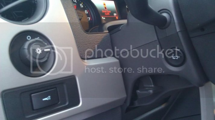
This subtle yet awesome change will be a love or hate relationship with people (Depending on how often one uses it). Notice the Pedal Adjustment has been moved to the steering column. I for one welcome the change as the dash panel looks more flowing and less crowded. Searching for it the first few times was a pain, but is easy to pick up. NOT a major draw back.
The "Turn Signal" is another brought over from the Super Duty. (Hard to Explain so bear with me). There are two stages or cycles to the turn single. Half tap or half stroke will give you 3 blinks and an auto shut off, a lane change signal if you will. A full stroke will enable the turn signal. Here's the tricky explanation for those not familiar. The Turn Signal lever will RETURN to the "Neutral" position but keeping the turn signal going Electronically until the turn has been completed. No more clicks or lever jolts when completing the turn. Nice yet subtle feature huh?
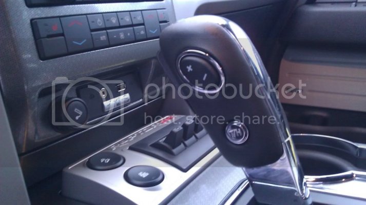
This is my most loved feature New for the 2011. The Manual Gear Selector. Instead of 1, 2, and 3 for the trans; you now how 1,2 and M. At first glance I thought the button placement would feel awkward for my hand and get uncomfortable, but the form fitting grip and button make it easy to use and quick response. Same downshift feel as the 2010 when selecting though, 1st is still a pain for the computer to rev-match it seems. But again, not a draw back.
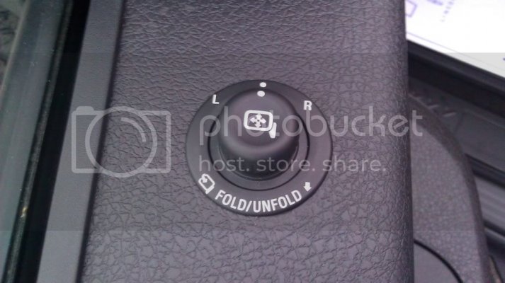
This speaks for itself. Should have been a no brainer on the 2010 when the truck is 7" wider than standard, but at least it's hear now. Both mirrors power fold in-n-out for ease of acces and use. Not picture is also a nice touch brought over from Edge and Lincolns. Approach lighting on the underneath of the side mirrors illuminate the truck in a pleasant way for added visibility and luxury, another wonderful added feature.
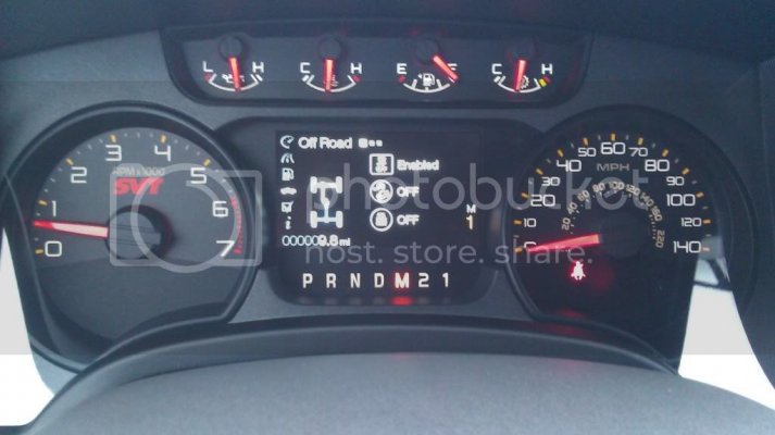
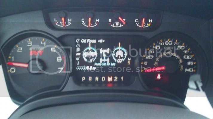
Again, another love/hate thing. I wish IMOP, that they would have kept the back gauges White for easy visibility and sport look, but the new gauges are nice as well. Upping the Speedo to 140 is a nice touch as well. The LCD screen is amazing and shows all you wanted it to before. Traction ENABLED, SPORT, or DISABLED. Off-Road ENABLED or DISABLED. Hill-Descent Enabled or DISABLED. Steering degree, pitch, yaw and a visible "Drive-terrain" that goes from White to Blue when you are in 4X2 and 4X4 along with a yellow dot that appears for the ELD. Solid Blue at a dead stop, and Blue with white "flowing" stripes when the truck is in motion. Real time to the 1/10 of a mile Average Miles Per-Gallon, Trip meters, Visible Trailer Sway and Braking Apps are just a few of the ups to this screen.
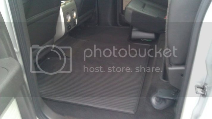
I'm excited about this for some reason. A floor mat that is massive and is cut to go UNDER the seat this time. So if the seat goes up for storage, no need to worry about getting the carpet dirty. Upside; Heavy and sticks very well to the carpet for NO slipping. Downside; Heavy and sticks so well, that moving it and aligning it in the truck is almost a two man job.
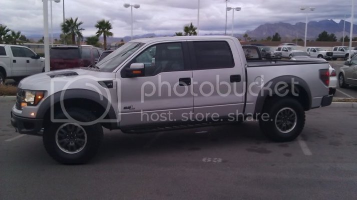
And finally, the truck itself. The running boards on camera look awkward for how long they are. But the shape and design actually fits the massive truck better than I thought. The truck looks almost too long (For my tastes). The silver looks great in person and I enjoy it more than I thought I would (I am an Orange and Blue fan). With the Driver's Seat full back, I still have about 6" of knee space. Again I'm 6'7" so this much space to me seems a bit much. You won't have guys my height in the back, and even if you do, the driver will have the seat halfway up to compensate for his height. (With my co-worker at 5'8" adjusting the seat and me sitting in the back, I had 10-12" of leg room and with my back against the seat and arms straight out, I couldn't touch the driver's seat). Again, too much room for a sports truck, but handy nonetheless. The "6.2L" badge is done very nicely. The look and feel (Not that many will touch it) fits very well. The "L" is hollowed out so the paint of the truck shows through, so the badge isn't as big, bulky, and gaudy as I thought when I first saw the pictures and concepts.
Overall the 2011 Raptor has the changes that many of us wanted from the start. Some changes were made to things we already liked, but that's just it. Give and take is what the 2010 and 2011 amount to. I hope this was helpful and if anyone would like to see something more specific or ask something specific, please do so! Happy Jumping!
Last edited:

