Are there any "Ford 6.2L" license plate frames?

Disclaimer: Links on this page pointing to Amazon, eBay and other sites may include affiliate code. If you click them and make a purchase, we may earn a small commission.

BRONCOBOY1

Full Access Member
Joined
Apr 13, 2012
Posts
143
Reaction score
24
Location
Temecula
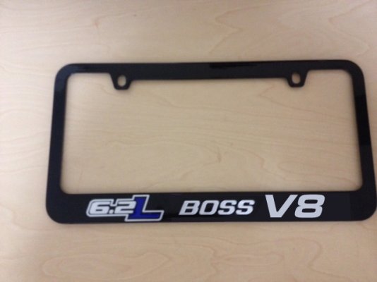
That looks great Mike! Question: Is the BOSS script supposed to be reverse italics? I wonder if it would look better if it leaned right (normal italics, to match the angle of the "6.2L" text).

Also, would it be easy to make a version that says "Boss 6.2L" (with Boss first)? Seems like that would sound better, considering that you decided not to include "V8" after Boss.
license-frame.jpg

license-frame2.jpg


Actually I like your layout better than mine if you guys are interested in these figure out which style you want and pick ONE. I'll make them

Mike
 

Humvee21

FRF Addict
Joined
Aug 17, 2011
Posts
4,848
Reaction score
538
In that case, I prefer the first one. With the "Boss 6.2L." The v8 just seems a little redundant. How much are you selling them for?
 
OP
OP
B

BMWBig6

Full Access Member
Joined
Nov 19, 2011
Posts
50
Reaction score
8
In that case, I prefer the first one. With the "Boss 6.2L." The v8 just seems a little redundant. How much are you selling them for?

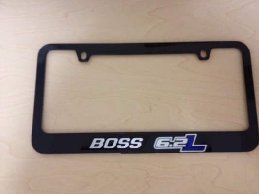
I agree, I prefer the first one too then. But then I wonder if the "BOSS" should be reduced in size to match the 6.2 letter height. I think that looks more harmonious and balanced.

license-frame1.jpg
 
Last edited:

Fred

FRF Supporting Member
Supporting Member
Joined
Sep 3, 2011
Posts
7,432
Reaction score
2,157
Location
Richmond, VA
Why no fake Crome chains around the plate, JFK

I like the first one as well...looks good

---------- Post added at 09:31 AM ---------- Previous post was at 09:28 AM ----------

Not a fan of the "V8"...makes it busy...just my thoughts
 
OP
OP
B

BMWBig6

Full Access Member
Joined
Nov 19, 2011
Posts
50
Reaction score
8
OK, so that's 5 votes for the first design. I suppose it's safe to say the winning design has been decided? I know I would be very happy with this, as long as the letter height for "BOSS" is the same height as the "6.2" part of the "6.2L" logo (and they are aligned vertically like in the photo below).

license-frame1.jpg
 
Top